
I’m trying to come up with a way to differentiate service patterns on the Tokyo map. I don’t want anything super fine-grained; some lines have seven different varieties of express services running on them and that would just be too unwieldy. That’s what strip maps are for. I just want to be able to tell the difference between local stations and local/rapid stations.
Here’s what I have for the commuter rail lines:
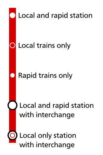
Pretty straightforward, I think. Filled circle for local/rapid stations, hollow circle for local stations (easy differentiation), smaller filled circle for rapid only stations (those do exist; they’re just kind of rare). Local-only lines would just have the filled circle. The problems start happening when we try and do the same thing with the subway lines (the Asakusa, Fukutoshin, Shinjuku, and Tozai lines all have rapid services in some form or other):
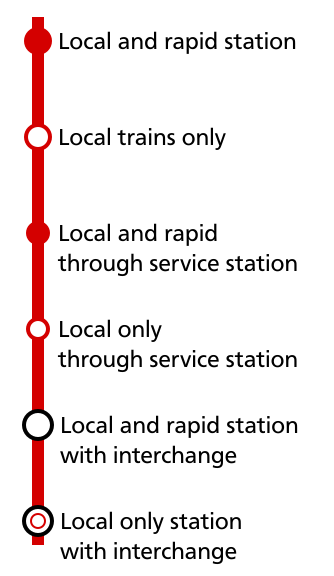
For the subway lines I want to not just differentiate between local/rapid stations but also want to clearly define through services, and in the latter case I don’t think using a slightly smaller station symbol does the trick. I also want the methods for telling everything apart to be consistent across all modes, so if I change it for the subway lines it’ll also have to change for the commuter rail lines.
Other notes:
- I’m not worried about rapid-only subway stations because thanks to the nature of Tokyo’s subway network those can’t exist.
- I don’t have much of a desire to split lines with local and rapid services into two separate lines unless they’re already embedded that way in the public consciousness (e.g. Chuo Rapid, Sobu Rapid).
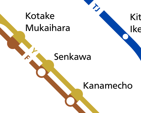
- This symbol:
 is already in use for tram lines.
 - I would like to avoid giving different stations different shapes if at all possible.
- I think this looks funny:
Anyway, that’s what I have so far. Any advice would be greatly appreciated.

Hey, I love this project and have been following this on twitter for quite some time. I’m am by no means an expert in this field as I am just a teenager with a unique hobby. I have never made a transit map of any sorts before so here’s my suggestion. So the local and rapid stations are good the way the are but, I feel like you should change local only and rapid only. Local only could have a L in the middle and Rapid only could have an R in the middle. This is just a suggestion because the rapid only and local and rapid look a little too similar. Alternatively if it is rapid or local you could use the same colours but have them off centred hanging on the side so it is easier to distinguish them from both rapid and local. I wasn’t going to say anything about this because I’m not very good at giving advice but I saw no one else helping you out so I hope this helps you out a little bit.
Best of luck to you!
-Luke